Full game progress update #4



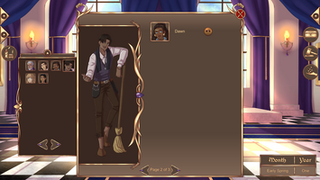
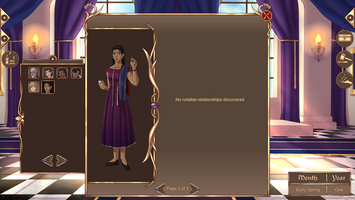
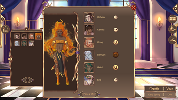
Hello, everyone! We have been working hard on Mistwinter Bay in the past few months and have reached a massive milestone in the game’s development: all 32 townsfolk are now completely finished! We will take a look at that under a separate headline, but first, I’ll present you with a list of things we have implemented since the new demo was released. Since there are so many things, I will divide the list into different subcategories (and I might also have forgotten to mention some things).
Keep in mind that these updates have been made to the full version of the game – no version of the demo will contain anything of what is mentioned in this post. We don’t have time to update the demo.
Loading times
- Significantly improved loading times
- Loading between dialogue, start-of-month throne room, town and map is instant
- No lag or loading when opening any menu (like the roster)
- As a compromise, there are a few longer loading times in other parts of the game that are not frequently accessed: when entering and exiting the character creator or Wardrobe, and when loading a saved game
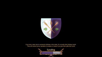
- Added a loading bar (no more staring at black screens when waiting!)
- There is also text for gameplay tips and lore during the longer loading sessions
- Also displays Mistwinter Bay’s coat of arms in the center of the screen
- Changed the “event completed”-soundeffect and the sounds for changing month, year and season
- Doing so significantly reduced the time to return to the throne room after a main event has been completed
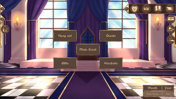
- When changing month, there are also decorations to represent the in-game season and year
Characters
- Added a new mechanic called “notable relationships” (more information below!) and new icons to represent a character’s opinion about other characters and the player
- Gave townsfolk opinions on which situations they are okay with killing someone in
- There are three categories: never, in self defense, and any situation
- There is a loss of reputation when a townsperson kills someone in a situation that they’re not okay with (i.e. someone who never wants to kill kills someone at all, or someone who is okay with killing in self defense is forced to murder someone in cold blood)
- Fully implemented the remaining townsfolk (Eugene, Laith, Zane, Sebastian, Yamileth, Faye, Te’Rohga, Edmund, Neferu and Moira). All townsfolk are now completed!
- Changed Birgit’s social class to lower class (being middle class in Utrua doesn’t equate to being middle class in Straena)
- Fixed some characters’ expressions (mostly mouth animations when talking)
- Added some gameplay impact to pairing up townspeople with each other
- Added the portraits of characters who certain OK-messages are about in the message box
Events
- Added 3 new short monthly events
- Added text to the game’s introduction further explaining the player character’s relationship with Jacques and Sophia, as well as clarifying what a sovereign is
- Added new dialogue backgrounds to represent Meblia, Utrua, Achait, Yscor and Ethal
- A “dialogue background” is the backdrop when the characters are shown
- Straena and Fleidal already have such backgrounds
- Added new event backgrounds to the coronation feast and Winter Solstice-event
Character creator
(Visual examples can be found under a separate headline!)
- Changed the appearance of the character creator and wardrobe to make them easier to navigate
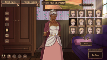
- There are now buttons with visual depictions of the current category (outfit, front hair, mouth, etc.) that allow you to quickly choose what looks appealing, instead of cycling through an “invisible” menu
- There are still arrows that allow you to cycle through the aforementioned buttons
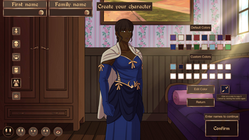
- It is now possible to copy colors to custom color slots
- Both custom colors and default colors can be copied to the custom color slot
- It is now possible to cycle through the default color options by using arrows next to the color-button (which is the button that takes you to the menu with default and custom color-buttons)
- Custom colors used on the player character are now unique to each playthrough
- Added a message to confirm leaving the Wardrobe-menu if there are unapplied changes
- Added a button that allows you to open or close your character’s eyes in the character creator and wardrobe
- The eyes will automatically close when clicking on the eyeshadow color button. They will open again when leaving that color menu
- The eyes will automatically open when clicking on the eye color button
- In both cases, you can still open and close the eyes manually when in the color menu
- Added buttons that allow you to see what the sovereign’s different expressions look like
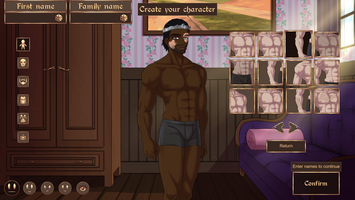
- Made it possible to pick a custom skin tone
- Instead of using the color wheel and value slider, it uses a square with skin tones that you can color pick from
- Added glasses as an accessory category
- There are currently three types of glasses
- Added “body details”
- Body details include freckles, body hair and scars
- Up to three body details may be used at the same time
- Body details can be changed in the wardrobe
- Added “face details”
- Face details include freckles, scars, blush, etc.
- Up to three face details may be used at the same time
- Face details can be changed in the wardrobe
- Added different eyeshadow styles
- Separated the eyebrows from the eyes, allowing you to select them separately
- The eyebrows can be changed in the wardrobe
- Eyebrows now have a base color under the lineart, allowing you to change the color of the eyebrows
- Added several new eyebrows
- Added 9 new beards
- Added 2 new eyes
- Added 2 new mouths
- All 3 of the player character’s height options are now slightly taller
- Changed the “default”/starting outfit in the character creator from dress 1 to shirt-and-pants-combo 2
- Gave the “regular male” body type new underwear to better show off the new body details
- Ensured that the player character and child can be named the same thing as any existing character (e.g. Jacques, Dawn, Guard) and the game will display who speaks properly
- Adding this unfortunately means that it is no longer possible to use dashes or spaces in the player character’s or child’s first name. Dashes and spaces can still be used in the surname
- Added several new unlockable outfits
- There are currently a total of 16 unlockable outfits that are obtained by doing certain things in the game
Town
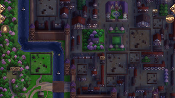
- Added moving icons above empty lots and buildings in the town view when there is enough resources to build on that lot, upgrade or replace the existing building
- Added a moving icon above the inn to indicate when there is a new visitor who has not been interacted with
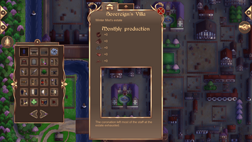
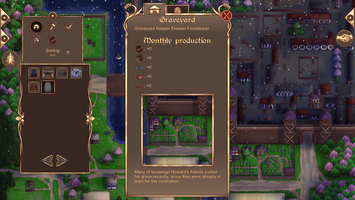
- Added a line of text for built buildings about what happened there during the previous month
- This has no gameplay impact - it’s just “a fun thing” for the sake of world building
- Added a chance for clouds to spawn during certain types of weather
- Made the smoke from chimneys move according to the wind if the weather is windy
- Added a chance for birds to fly over the town
UI and menus
- Added a new pop-out bar to replace the book-button. The book-button used to contain the roster, foreign leaders roster and encyclopedia. Those menus have their own buttons now. The map-button has also been put on the new pop-out bar
- Changed the icons on some buttons
- Changed the way most menus are navigated by adding buttons that you can click on to instantly go to the menu entry you want to see. Also made it possible to sort the buttons based on player chosen categories (more details under a headline below)
- The menus that have been affected are the roster, foreign leader roster, country menu (when looking at the map) and all lot types in the town view
- This change also means that all types of buildings and lots (built and not built) are now in the same menu in the town view!
- Changed how the trade menu works (visual example under a headline below)
- Which side is for buying and selling is now labeled accordingly
- Moved the arrows to increase resources to the “buy”-side
- It’s now possible to buy multiple resources at once
- The trade rate for each buy-resource with the currently selected sell-resource and trade partner is now displayed on each buy-resource
- A star is now shown on the resources you can buy if that resource is the cheapest with the currently selected trade partner. Which partner has the best deals for which resource is always shown next to the partner-button in question
- All resource increases/decreases are now shown directly above the trade button (which is now labeled “Confirm Trade”), in addition to the respective UI-elements on the buy- and sell-side of the menu
- Added visual effects to resources affected in the trade when a trade has been confirmed
- Gave the “Confirm Trade”-button a unique sound effect
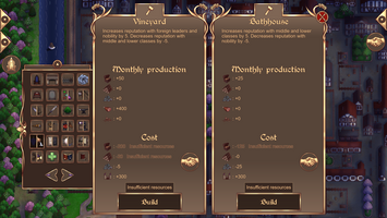
- When low on resources to build, upgrade or replace a building, a trade button will show up in that menu. When clicking the button, a special version of the trade menu is opened, containing a square which shows how many resources are missing in order to build the building in question. When exiting this version of the trade menu, the previous build/upgrade/replace-menu will be opened again
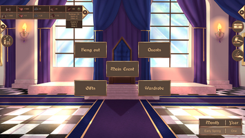
- When hovering over monthly resource production on the resource-bar, there is now a drop-down square with information on where the resources are coming from
- Both income and expenses are shown
- Added new types of reputation pop-ups, primarily grouping individual character reputation changes into a single one, like “Middle Class” or “Avallerists”
- If not all characters in a specific group gets a reputation change, it also says “Most”, as in “Most Lower Class”
- When entering the hangout-menu, personal quest-menu or when giving gifts, the starting page is now the page that was open last time
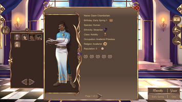
- Added icons to represent different categories (ethnicity, social class, religion, reputation, active birthday) in the character rosters. These icons are in addition to the text
- Added more variations of hearts in the roster-menus to indicate if a character is married to, uninterested in or detests the player character
- Added indications on the gift-buying-button if you can’t afford that specific gift
- Added the cake-icon on the gift-giving-button next to the name of whoever has a birthday during the active month
- Added the new reputation opinion icon on the gift-giving-button
- Added the in-game date to the pause-menu
- It isn’t shown during the game’s intro
- Changed the angle of the cursor-sprite to better align with the standard Windows-cursor
- Decorated the pause-menu
- Did some other minor UI changes
Settings and saving
- Added a setting to turn on or off the new icons hovering over lots in the town view
- Added a slider setting to change the opacity of the dialogue textbox background
- Added a checkbox setting to always keep a simple dialogue textbox background
- When the sovereign’s villa gets upgraded to keep and castle, the textbox background gets more detailed. This setting makes it possible to keep the decor-free background that’s used for the villa throughout the entire game
- Added options to change the speed of reputation and resource pop-ups
- Added options to change the amount of speaker particles in dialogue or turn them of completely
- Added the option to show or not show exact reputation numbers in menus
- Numbers are still shown in reputation pop-ups when reputation is changed
- If not showing exact numbers, only the new opinion icons will be shown. This might increase the game’s difficulty a bit
- Added the option to keep or not keep the different bars’ positions when opening menus and going between “game rooms” (moving from the throne room to town, etc)
- If this setting is turned off, the bars will always start “tucked-in” at the start of a game room. They will also automatically move in when a menu with a red exit cross is opened
- When not using a permanent savefile, the game will now automatically save on a specific “Seasonal Autosave” the first time per season that you enter the throne room at the start of a month
Bug fixes
- Fixed a typo that made MG not count as a woman when picking actors for the stage play (among other things)
- Fixed a bug where the player character’s colors weren’t reset when exiting the Wardrobe-menu without applying the changes
- When saving during the game’s introduction, savefiles now display the in-game date as “Prologue”, not “Early Spring Year 1”
- Removed “gray borders” around sprites with transparency (which basically means all sprites in the game except backgrounds)
- This was due to the drawing program we use to create the game’s sprites having something odd going on in the alpha channels
- The gray borders were never very visible on our regular computers, so we didn’t know they existed until we tested it on a different computer. We also didn’t figure out where they came from until fairly recently
Loading times and optimization
We have worked around the limits of the game engine, restructured the game’s resources and – most important of all – adjusted the game’s loading logic to fit this game, not the games that are typically made with the game engine we use. Due to our inexperience with programming, we have had to rely a lot on the game engine’s official documentation’s recommendations and recommendations for the game engine on various forums. Needless to say, not all suggestions and common recommendations fit all games, and due to the scope of Mistwinter Bay, they did not work for it. We have gained experience and learned from that and found the method that does work for Mistwinter Bay.
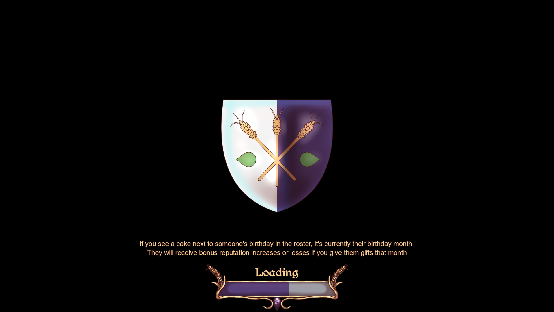
Loading into the sections of the game that are accessed frequently is now instant. To ensure that everything works correctly, the game has slightly longer loading times when entering and exiting the character creator and wardrobe, and when loading a saved game. These slightly longer loading times are necessary to double-check that not too much memory is being used. They are not longer than in any other game with loading screens – and the presence of the loading bar and loading tips makes all types of loading feel faster than in the demo.
Improved menus
Some of the feedback we have received has been about specific menus being clunky and difficult to navigate, which we completely agree with. For that reason, we have overhauled most of the game’s menus to make them faster and easier to navigate. The most important way we have done that is by adding buttons that give you immediate access to whatever it is you want to look at.
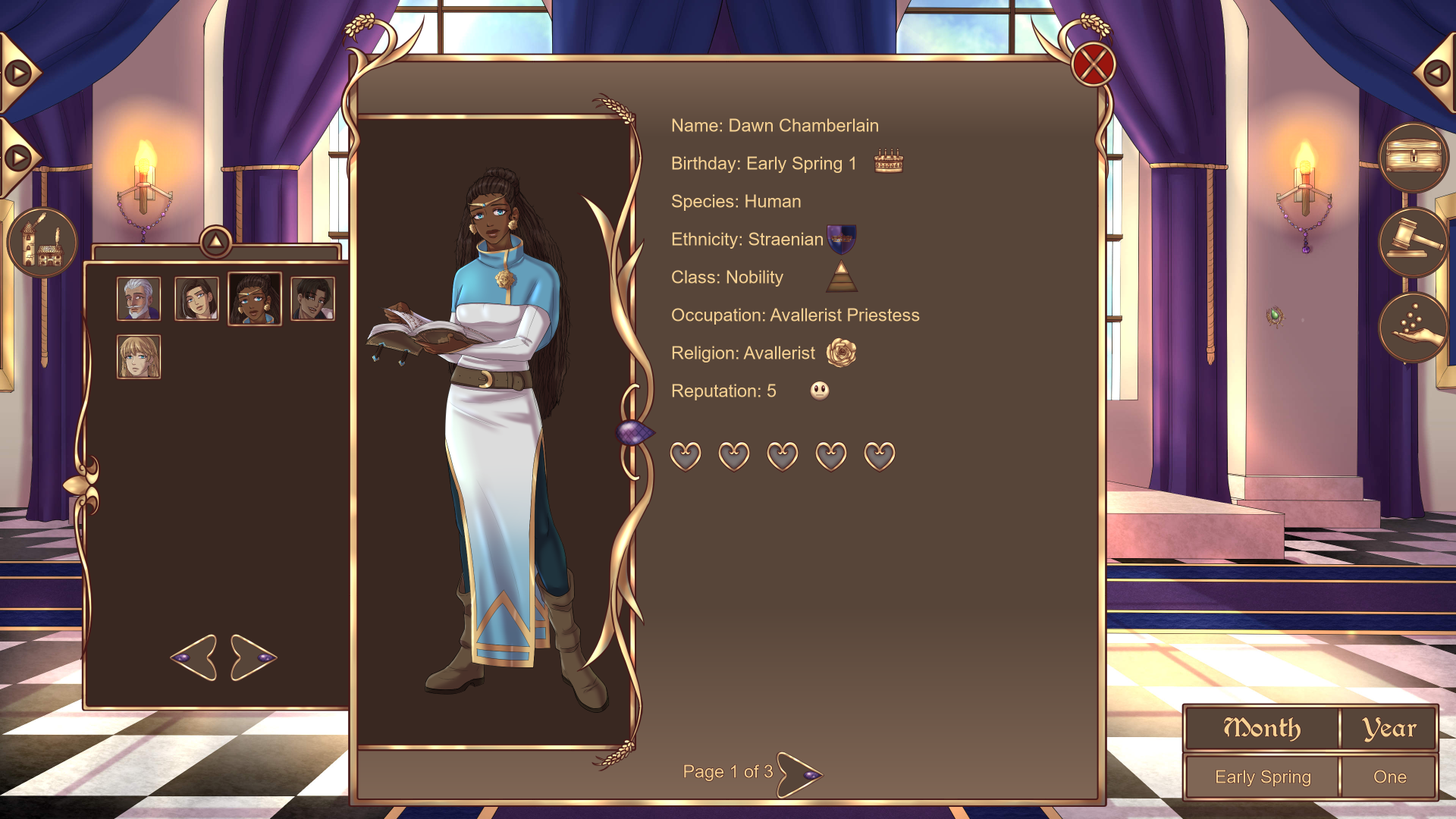
Take the character roster, for example. In the demo, you have to cycle through every character to get to the one you want to access. In the full game, you can simply click the button with that character’s portrait, and you go to their entry immediately! If you still want to cycle through any menu, though, you can use the arrows below the buttons.

This overhaul also meant that we combined the built buildings and unbuilt lots into a single menu, giving a comprehensive overview of all possible lots. This also means that there’s no longer a need to go looking for any unbuilt lots that you might have missed – you can just click on any building or empty lot, and you will gain access to all of them. Unbuilt lots that can have two different buildings have the buildings’ icons separated with a line on the button.

Since it might still be difficult to differentiate between built and unbuilt lots – or if you want to find a specific type of character, like a Voidist woman – you can sort the buttons to your liking. Every menu that has these types of buttons can be sorted. The categories that the buttons can be sorted by vary between menus.

Another thing that makes building easier is the addition of the icons shown above. When any such icon appears over a lot, it means that a building can be built there (that is, you have enough resources available to build it). If an icon is above a built building, it means that it can be upgraded or replaced. There’s also an icon over the inn to indicate if there’s a visitor you haven’t met yet.
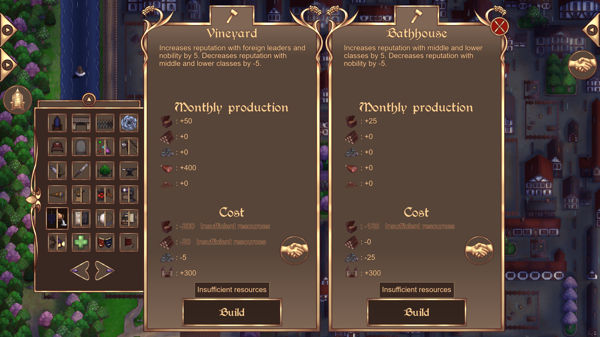
Yet another thing that makes building easier is a change in the visuals of the building menu. It’s now very clear if there aren’t enough resources for a specific building. In addition, if there aren’t enough resources, there’s also a button that takes you straight to a special version of the new trade menu.
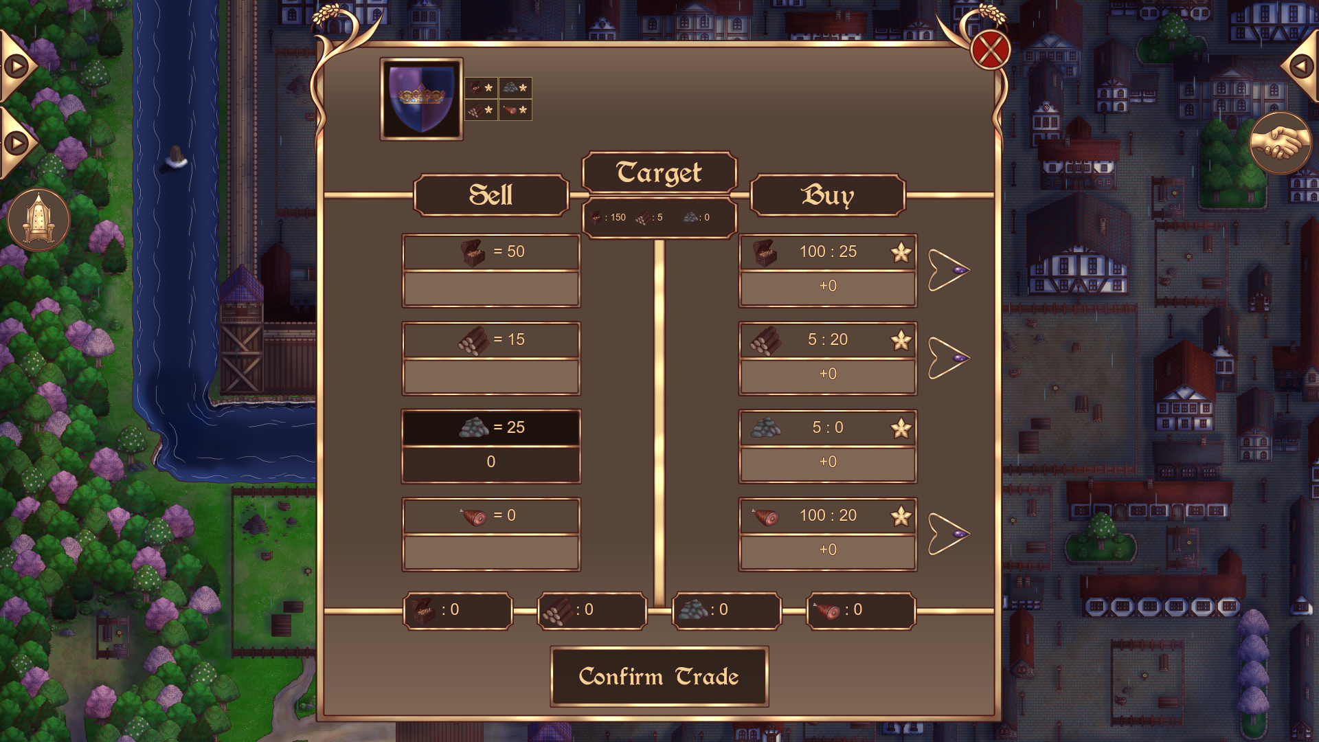
In the above image, the “Target”-square and the square below it indicate how many resources are needed to build the building that the trade menu was accessed from. The numbers increase or decrease based on the resources you buy and sell. When this special version of the trade menu is closed, you are immediately brought back to the building menu you accessed it from.
As is evident from the image, the trade menu has gotten a complete overhaul. The most important feature is the ability to buy multiple resources at once. It’s also a lot more clear which side is meant for what (buying or selling). The top numbers on the buy-buttons indicate how much a base amount of that resource costs to buy with the currently selected sell-resource. In the example above, it’s 25 stone for 100 gold, 20 stone for 5 wood and 20 stone for 100 food. If that deal is the best one for that buy-resource, there’s a star on the buy-resource. A star also shows up next to trade partner-buttons if that trade partner has the best deal for that resource. Different trade partners have different specialties, but Straena (which is the only trade partner at the start of the game) has the worst deals in general.
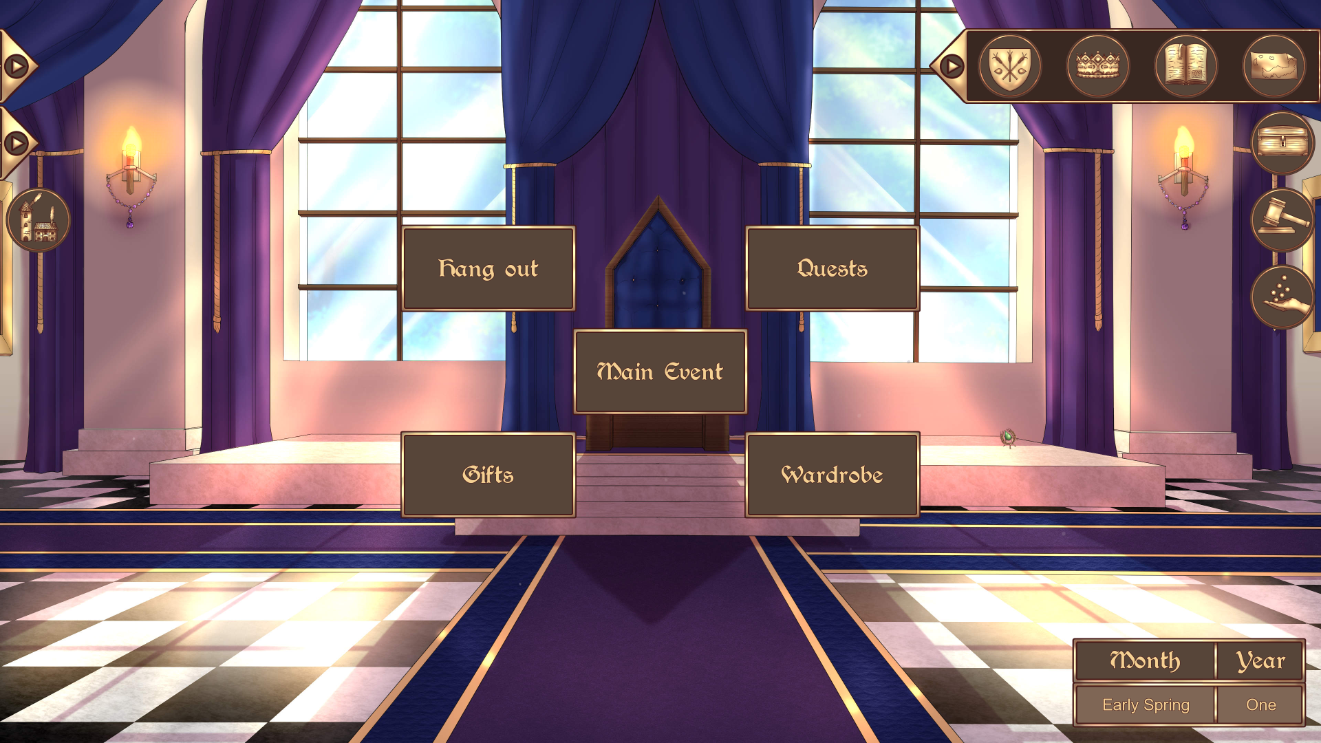
The book-button has been replaced with a bar containing separate buttons for the menus that were previously nestled inside of the book-button. This bar is present in dialogue, the throne room at the start of a month, the town view and the map. This means that you’re no longer forced to leave the town view just to look at the roster entry of someone who moved in!
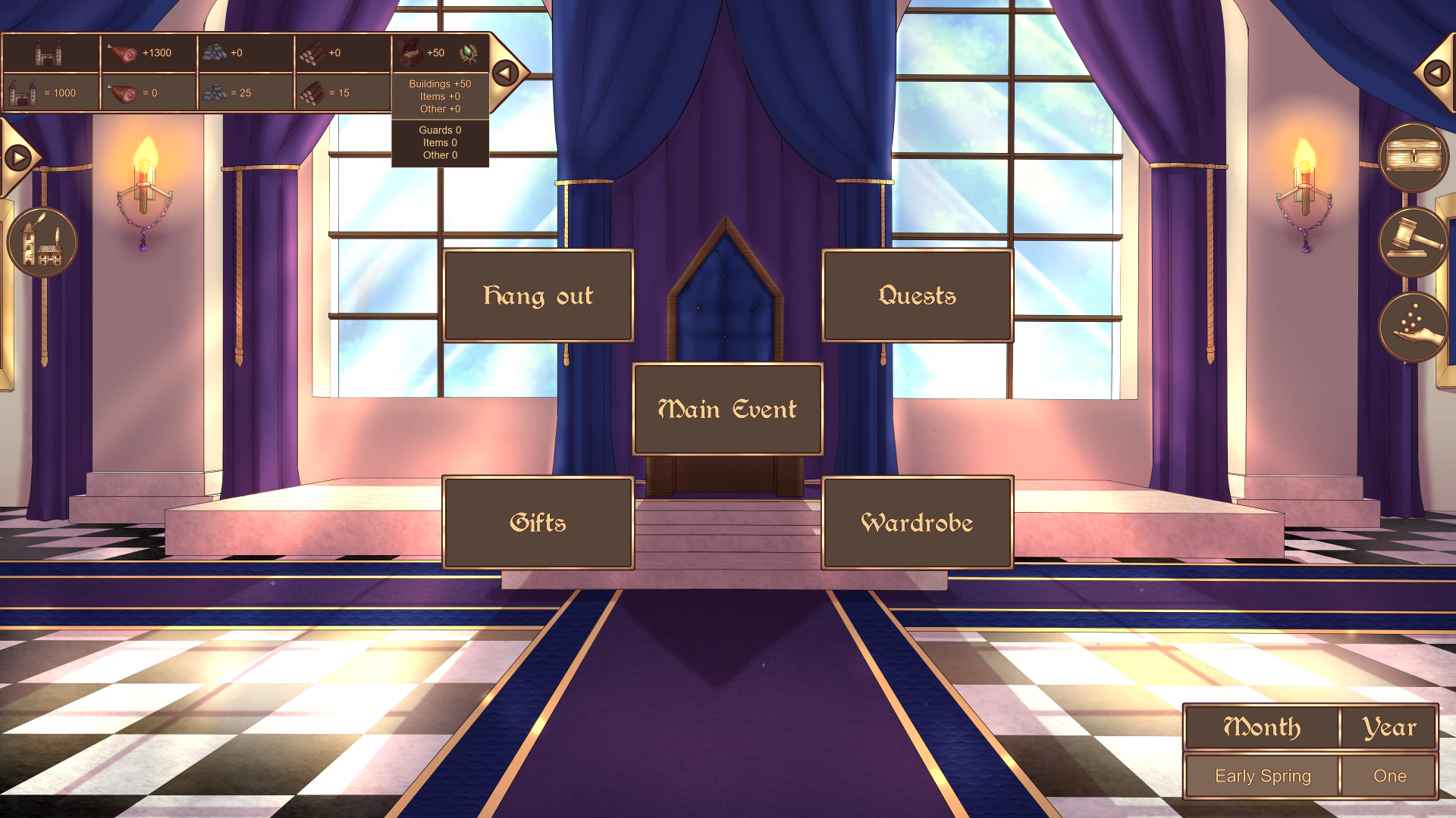
The resource bar now displays where resources are coming from when hovering over a monthly production-square. Every resource has the income categories Buildings, Items and Other, as well as expense categories Items and Other. “Other” is usually event related sources. Food also has Base as an income (which is the production the game starts with). Gold has Guards as an expense. Coins has Taxes as an income and a bonus square for Seasonal (the gift given by the religious building at the start of a season). Population doesn’t have a drop-down square, since it doesn’t have a monthly production
Character creator
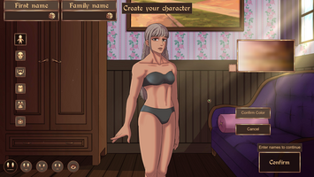
As with a lot of the other menus, the character creator (and wardrobe) has received a quality-of-life-upgrade. A few new categories have also been added to customization (those being glasses, eyebrows and body- and face details), as well as the ability to make a custom skin tone.

We have probably said somewhere, at some point, that we weren’t going to add custom skin colors. That was due to two things: us not wanting to ruin the immersion by giving the player completely free reigns with the color wheel, and the fact that we didn’t have a good solution for how to include the red light that shows that it is skin and not another material, like plastic. We also knew that it would probably be tricky for players to freely pick a “good-looking” skin tone with a color wheel. But we managed to find solutions for both issues. Instead of a color wheel, there is a square of skin tones, as shown in the image above, when picking the skin tone and certain types of body- and face details. Some coding and separation of different parts of the player body allowed us to adjust the strength of the red light – and also some shading – based on the skin tone, making both the lightest and darkest skin tones look good. Naturally, if you don’t want to choose a custom skin tone, there are default colors to choose from, too.
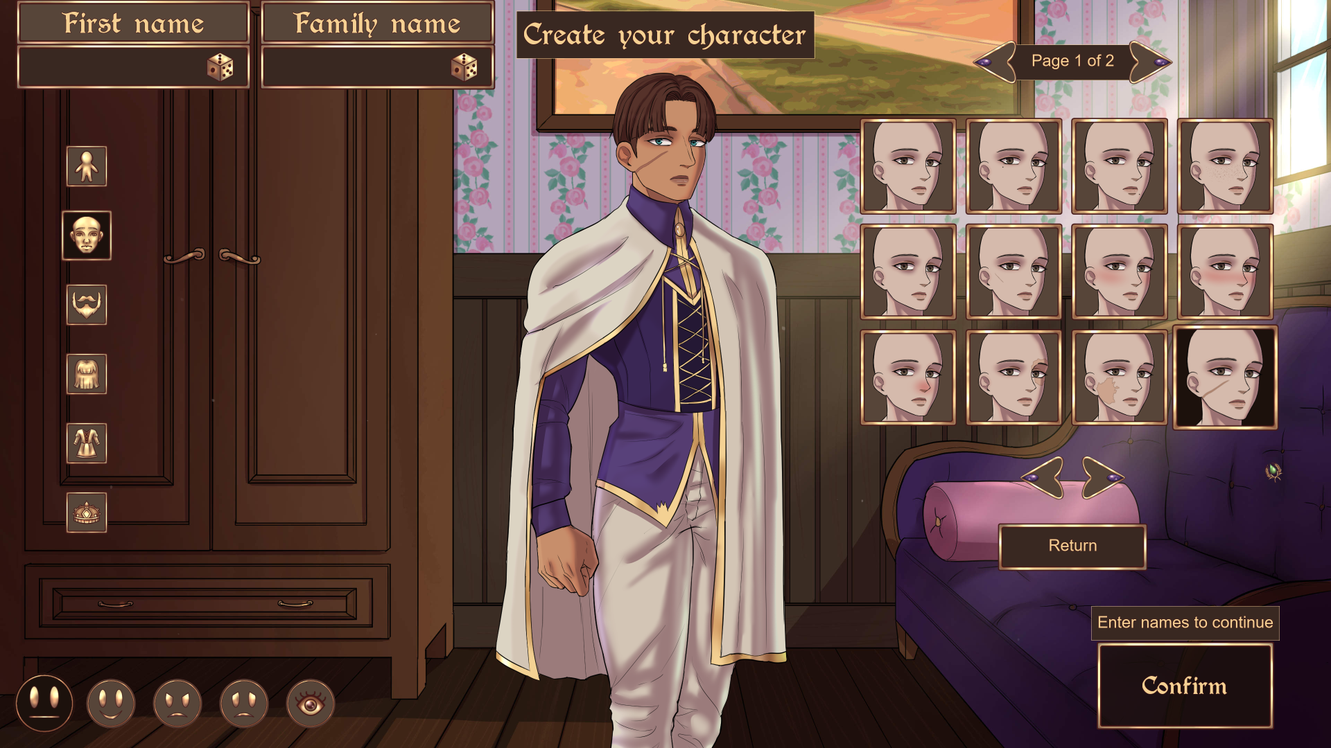
By adding buttons with visual depictions of the possible options – like front hair, outfit or beard – it’s now a lot easier to find things you like. It also gives a much better overview of said options. In the demo, you have to cycle through every option blind. In the full game, you click a button of the aspect you want to change – like “Eyes” – to access this menu. Then, click the image that speaks to you. The options can be cycled through by using the arrows at the bottom. The arrows at the top changes the page, if there are multiple pages available.
In the image above, you can get a sense of what two of the new customization categories are. The details shown above are for the face, but there are similar types of options for the body, too. Depending on the type of detail – for example, if it’s body hair or a scar – either the skin tone square or color wheel will be used to pick custom colors.
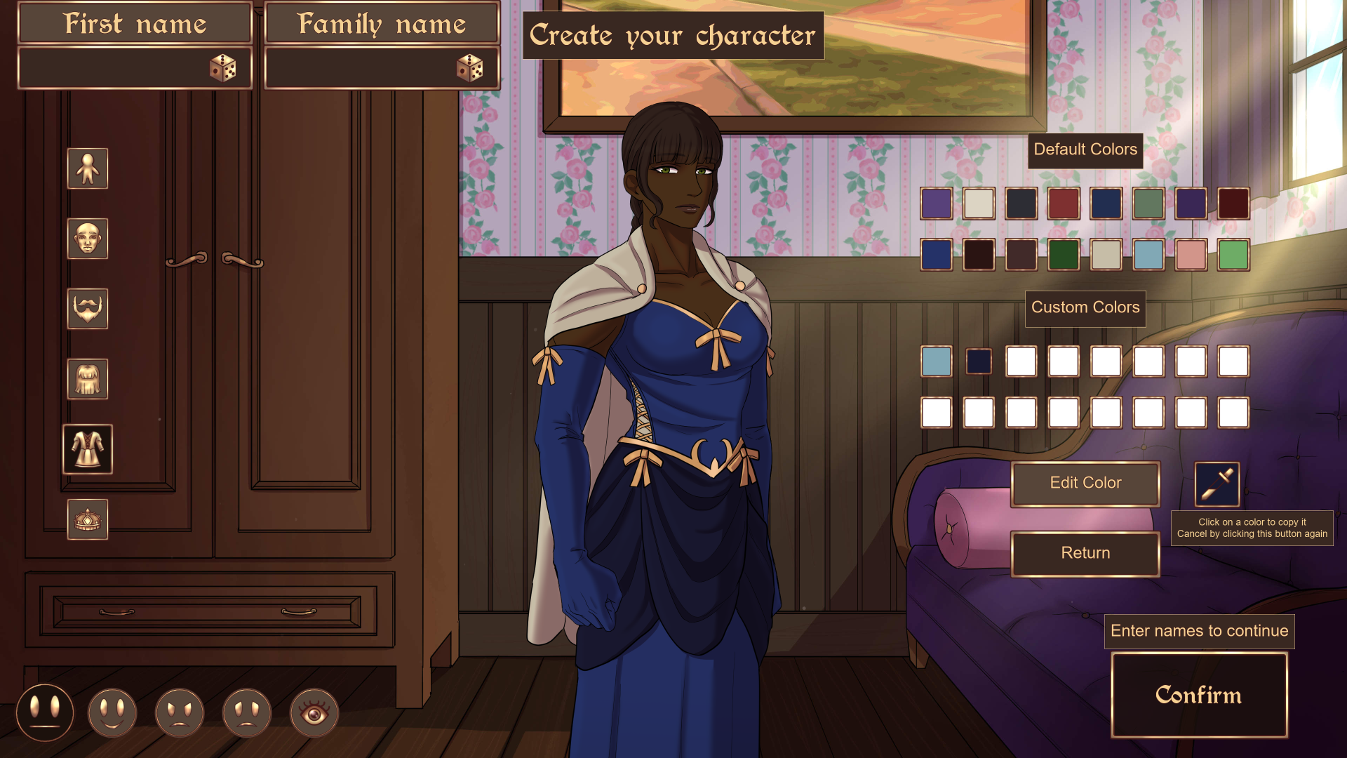
It’s now possible to copy colors as well. When a custom color slot is selected, a copy-button appears. If the copy-button is toggled, whichever color slot – regardless of if it’s a default or custom one – that is clicked will be copied to the active custom color slot. This makes it a lot easier to match certain aspects of the sovereign’s appearance. It’s worth noting, however, that there are separate custom colors for options that use the color wheel and the skin tone square. This means that you can’t get a blue color as a skin tone by copying a color from the eye color-menu, since the skin tone-menu uses different custom colors.
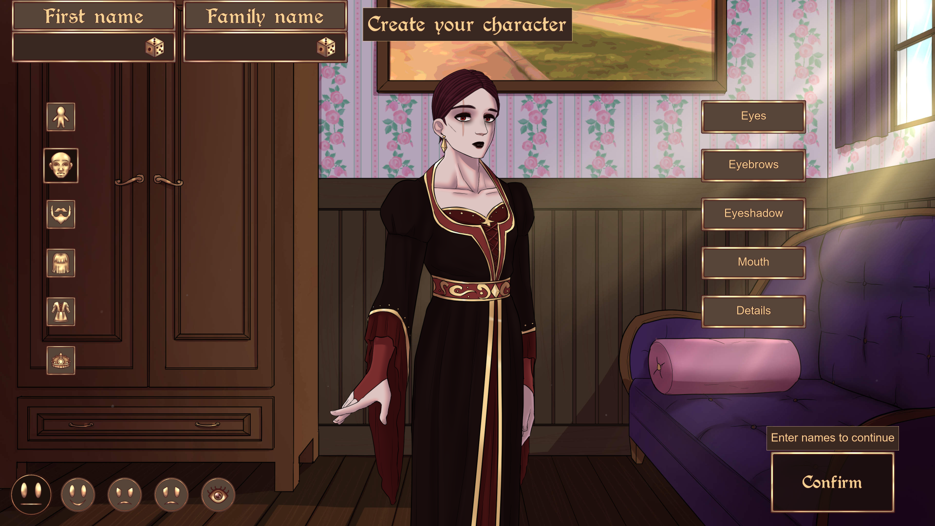
Let’s close this headline off with some examples of sovereigns you can create now!


Notable relationships
A big aspect of the game and a focus for us as developers are the game’s characters. Regardless of their profession, social class or nationality, we want them to have their own, unique personalities. That is primarily portrayed in their character stories, which means that it can be easily missed – or deliberately ignored. Therefore, we felt that it would be a good idea to give them more depth in the rest of the game, too, by introducing a new mechanic called “notable relationships”.
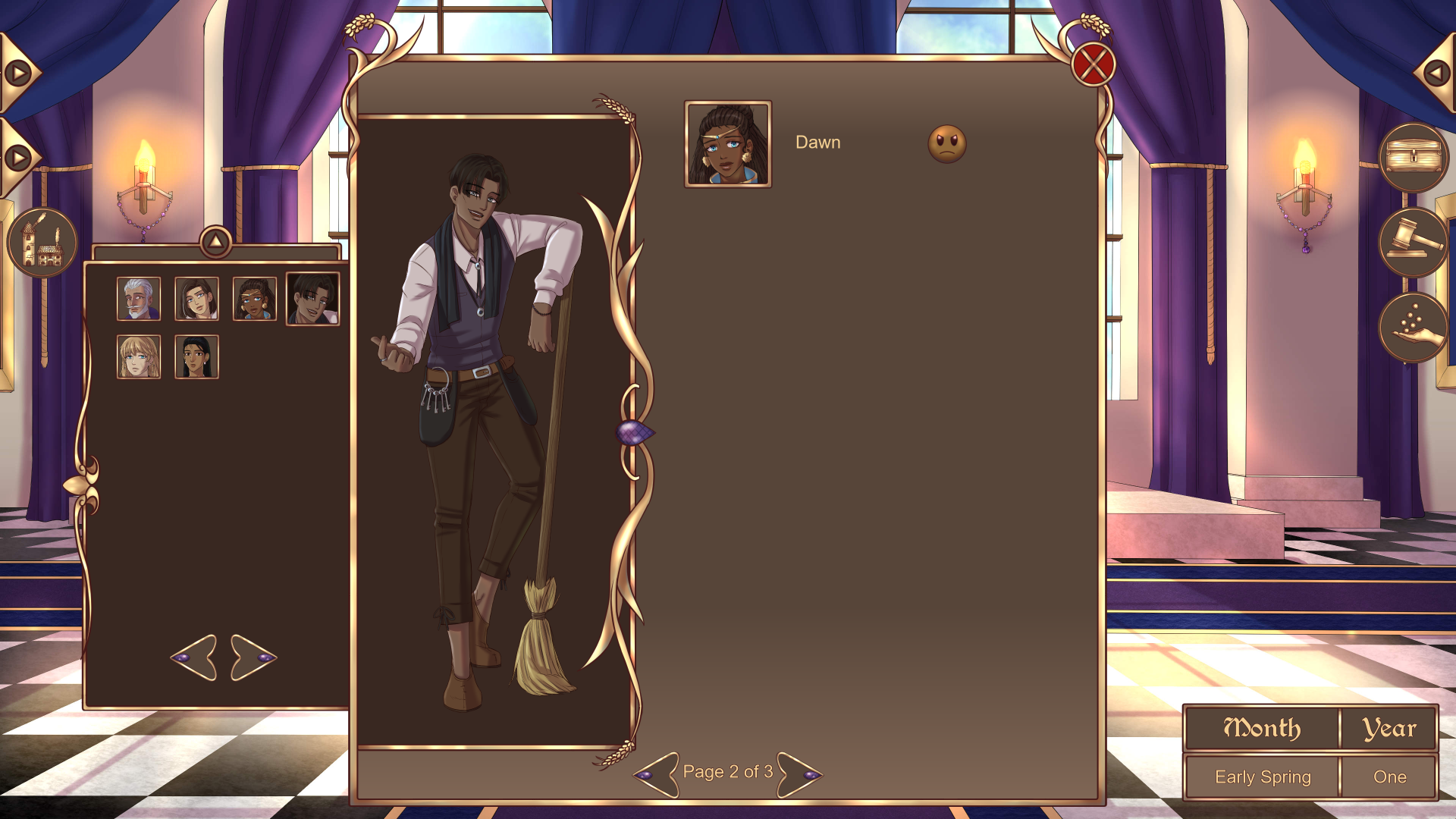
You can view notable relationships in the townsfolk roster and foreign leaders roster. This new menu page shows any and all characters who the character who is selected in the menu has an opinion on. The opinion can be positive or negative, just like reputation with the player character. Instead of numbers, the opinions are represented with “smiley faces”. These same faces are now also included next to characters’ reputation in the rosters.
But what’s the actual gameplay impact of this? In short, if something happens to a character who someone has an opinion on, reputation will change. Depending on if the opinion is positive or negative, reputation will increase or decrease based on what happened.
As a general rule, if Character A dislikes Character B, they will gain reputation if something bad happens to Character B – they move out, get imprisoned, etc. If Character A likes Character B, they will lose reputation if something bad happens to Character B. The opposite applies if the situation is positive – like the sovereign marrying Character B. Naturally, if Character A only slightly dislikes or slightly likes Character B, the reputation change will be lower than if the opinion was stronger. If the opinion is low enough, Character A won’t react in certain situations, whilst Character C, who has a stronger opinion, will react in all situations.
This new feature not only gives the game’s characters more depth and personality, by showing what their social circles look like, but also makes it more important to know them. After all, if you know that Cecil dislikes Dawn, it will come as no surprise that he gets relieved if she moves out. It can also give an incentive to be “not so nice” to certain characters, if a character you like dislikes them, or vice versa.

There can of course be instances when you haven’t met the people who are important to a townsperson. In those instances, no notable relationships will be shown for that character. Jacques and Sophia have no notable relationships.
It might also be good to know that notable relationships indicate which townsfolk might appear together in a short monthly event, also known as a “meetup”. Both positive and negative opinions can indicate a meetup. The only definitive clue to figuring out who might appear together in a meetup is if they have opinions of each other. Keep in mind, though, that there are some pairs of characters who have opinions about each other who won’t have a meetup together. That’s due to the fact that all townsfolk have 5 notable relationships, but only 2 meetups. (We are at least aiming for 2 meetups per townsperson, but I won’t make any promises.) A townsperson who is in a relationship with another townsperson and doesn’t have their partner as one of their 5 notable relationships will get the partner added as a sixth opinion.
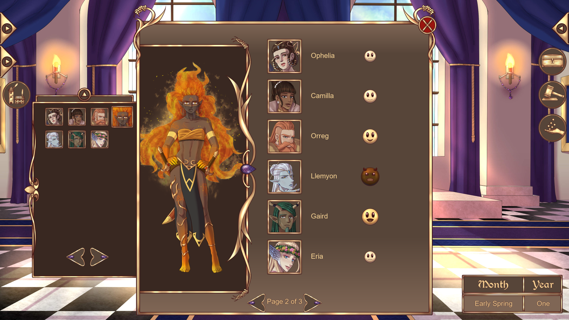
The foreign leaders also have notable relationships, but they aren’t as important as the townsfolk’s. That’s because a lot of the scenarios that makes reputation change due to notable relationships doesn’t apply to foreign leaders. For example, Se’Vah can’t get happy because Llemyon moved out of Mistwinter Bay, since he never lived there. Instead, their notable relationships serve more as an overview of the Hruminian political climate and an indication of who will dislike you if you form an alliance with someone.
Oh, and if it wasn’t clear from the previous information, it is possible to pair townsfolk up with each other under very specific circumstances. One such circumstance is available in the demo, and so far there are three more in the full game.
Townsfolk
A while back, we reached a massive milestone in the game’s development: all of the 32 townsfolk are now completed, from first introduction to endings! Completing them means that everything that is unique to that character has been written, implemented and tested. This marks a big portion of the game’s content being complete (which should be self-explanatory from the fact that we have 38 romanceable characters).
If you’re curious about how much content there actually is, let me present you with some numbers:
- The townsfolk’s stories (+ the foreign leaders’ first three hangouts) contain 817.459 words (1.136.643 words with programming. We write the story scripts as code from the start to save time when implementing)
- As a comparison, The Lord of The Rings-trilogy contains between 480.000 to 576.000 words, depending on the source
- The townsfolks’ stories contain a combined minimum of 1027 choices (we counted choices in the larger events on the low end, so there are more)
- 320 of those choices are purple
- 707 of those choices are gold
- Instances where a character can be sent out has not been included in these statistics
- Opinions on adoption aren’t included either
These numbers do of course not include the foreign leaders’ full stories, any monthly events or the main story, which means that we already have a lot more words and choices than the ones above – and we will get even more before the game is completed. Needless to say, Mistwinter Bay will be a massive game in terms of choices and content. As such, we will not be adding any content to the game after it has been fully released – it will have enough at launch, which has always been our goal.
Continued development and staying informed
With all of the previously mentioned improvements and additions behind us, we will now move on to working on three things simultaneously: implementing the main story (which will be done fairly soon), finishing the foreign leaders and adding enough monthly events to cover several playthroughs of the game. Out of those tasks, adding monthly events will be the most time consuming and work-heavy. We will also try to start playtesting everything properly once we have enough monthly events to last for one playthrough. We are aiming to release the full game this fall.
It will probably take yet another while before we post a full game progress update again, but if you want to stay more up-to-date, we post short, weekly updates on our Patreon (https://www.patreon.com/swordlakeentertainment) and on our Discord-server. You can join our Discord by using this link: https://discord.gg/z7rm7d9p. On Discord, you can also find other players to discuss the game with, or give feedback directly to us developers. We’d be happy to see you there!
Of course, you can also follow us here and on social media. Wishlist the game so that you don’t miss upcoming development news and, most importantly, the release date of the final game! You can find us here:
Discord: https://discord.gg/z7rm7d9p
Patreon: https://www.patreon.com/swordlakeentertainment
YouTube: https://www.youtube.com/channel/UCICWzkpUmB-Xv_52sAh_tUw
Twitter/X: @swordlake_ent (https://mobile.twitter.com/swordlake_ent)
Instagram: @swordlake_entertainment (https://www.instagram.com/swordlake_entertainment/)
TikTok: @swordlakeentertainment (https://www.tiktok.com/@swordlakeentertainment)
Thank you for your support!
//LevUNknown, lead developer
Get Mistwinter Bay
Mistwinter Bay
Rule a town! Interact with townsfolk and foreign leaders, build, and tackle randomized events that affect the town
| Status | Released |
| Authors | Swordlake Entertainment, LevUNknown |
| Genre | Role Playing, Visual Novel |
| Tags | 2D, Character Customization, City Builder, Dating Sim, Fantasy, Life Simulation, Meaningful Choices, Medieval, Multiple Endings |
| Languages | English |
| Accessibility | Color-blind friendly |
More posts
- Mistwinter Bay fix: Version 1.2.0.3Mar 11, 2025
- Mistwinter Bay fix: Version 1.2.0.2Mar 07, 2025
- Mistwinter Bay fix: Version 1.2.0.1Mar 04, 2025
- Mistwinter Bay update: Version 1.2.0.0Feb 28, 2025
- Mistwinter Bay update: Version 1.1.0.0Jan 09, 2025
- Mistwinter Bay fix: Version 1.0.2.1Dec 08, 2024
- Mistwinter Bay update: Version 1.0.2.0Dec 04, 2024
- Mistwinter Bay fix: Version 1.0.1.1Nov 25, 2024
- Mistwinter Bay update: Version 1.0.1.0Nov 19, 2024
- Mistwinter Bay is out now!Nov 15, 2024
Comments
Log in with itch.io to leave a comment.
This looks amazing
Thank you, we're very happy to hear that!
You do such great work on this game, and I can't wait to play the full thing whenever it releases :D Take your time, because I bet it'll be amazing!
Thank you, it's really encouraging to hear that!